You might not recognize the name of Marcellin Desboutin, but you would know him if you saw him in the street. His is the bearded, dishevelled face staring despairingly out at you from a table in the artists' café La Nouvelle Athènes in the painting L'Absinthe (Dans un Café) by Edgar Degas. The women sitting next to him is the actress Ellen André; like the rest of the Impressionists, Degas preferred to use members of his immediate social circle rather than paid models. Once you have committed Desboutin's face to memory, you will chance upon it again and again in works by Degas and other artists, including Manet, Monet, Renoir, and Falguière; often he is smoking a pipe. His tramp-like appearance made him the ideal sitter if you wanted to paint a down-and-out old drunk.
![]()
Actually, Marcellin Gilbert Desboutin came from a well-off, cultured background. He was born in Cérilly in 1823. His mother was an aristocrat, and Marcellin was a wealthy young man whose dabblings in literature and art were enthusiastic hobbies rather than career choices. He bought himself a grand villa outside Florence, where he lived from 1854, dealing in old master paintings, gambling, and generally squandering his fortune. During this time, Desboutin maintained contacts with the Paris art world, and was particularly close to Degas. In Florence he met and encouraged the Italian Impressionist Giuseppe de Nittis, with whom he remained on close terms; there exists a drypoint portrait of Degas about which experts remain divided as to whether it is by Desboutin or de Nittis.
![]()
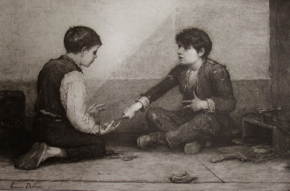
Marcellin Desboutin returned to Paris in 1873, at the age of 50, having ruined himself with unwise investments. Here he returned seriously to art, both painting and printmaking. Desboutin specialized in portrait drypoints, often of fellow artists such as his friends Degas, Renoir, Manet, Morisot, Raffaëlli, Goeneutte and Guérard, but also of authors such as Dumas fils, Zola, and Verlaine. Desboutin's technique was to quickly sketch a portrait on copper with a drypoint needle, to catch his subject in as relaxed and lifelike a pose as possible.
![]()
![]()
![]()
One of Desboutin's portraits of artists, that of Pierre-Cécile Puvis de Chavannes, uses a very interesting mixed technique, invented by Félicien Rops and used infrequently by artists such as Louis Legrand and Desboutin. Based on a painting by Desboutin now in the Musée d'Amiens, this print involved making a héliogravure plate after a painting (as in this case) or an etching that needed to be reduced in size (as in the case of Legrand's La parole divine, my only other example of this process); the artist then worked on top of the heliogravure with a drypoint needle, thus producing a strange hybrid between a reproduction and an original print. The composition in the background is part of Puvis's Bois sacré.
![]()
Another artist portrait, that of the etcher Jules Jacquemart, strikes me as possibly originating in a photograph, though Jacquemart was still alive when it was made, so I may be wrong - certainly neither the publisher, the Gazette des Beaux-Arts, nor the cataloguer, Clément-Janin, suggest this to be the case.
![]()
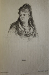
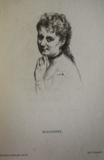
It's interesting to compare the vivacity of Desboutin's portraits from life, such as those of Goeneutte and Renoir, with the eight drypoint portraits of singers and dancers for the anonymous work L'Opéra, Eaux-fortes et Quatrains in 1876 (the author was Henry Cohen). Seven of these are drawn after photographs rather than from life, and although they have great charm, they are much stiffer and more conventional than the free depictions of his friends; the exception is the portrait of Léontine Beaugrand. On all eight the printer, Vve Cadart, has misspelled the artist's name as Desboutins.
![]() Marcellin Desboutin, Charles-Amable Bataille
Marcellin Desboutin, Charles-Amable Bataille
![]() Marcellin Desboutin, Mlle Baux
Marcellin Desboutin, Mlle Baux
(soprano, dates unknown)
![]() Marcellin Desboutin, Léontine Beaugrand, danseuse
Marcellin Desboutin, Léontine Beaugrand, danseuse
![]() Marcellin Desboutin, Rosine Bloch
Marcellin Desboutin, Rosine Bloch
![]() Marcellin Desboutin, Auguste-Acanthe Boudouresque
Marcellin Desboutin, Auguste-Acanthe Boudouresque
![]() Marcellin Desboutin, Eugène-Charles Caron
Marcellin Desboutin, Eugène-Charles Caron
![]() Marcellin Desboutin, Pedro Gailhard
Marcellin Desboutin, Pedro Gailhard
![]() Marcellin Desboutin, Rita Sangalli, danseuse
Marcellin Desboutin, Rita Sangalli, danseuse
Despite his late start, Desboutin achieved some fame and success as an artist in the Bohemian circle of Manet and Degas; he exhibited six works at the Second Impressionist Exhibition. The catalogue of his works in Clément-Janin's La Curieuse Vie de Marcellin Desboutin lists 246 original prints and 30 "gravures de réproduction" after artists such as Israëls, Fragonard, and Rembrandt; there's also an impressive list of paintings, showing Desboutin to have been hard at work at his art from 1873 to his death.
![]()
From 1880 Desboutin lived mostly in Nice, where he died in 1901.

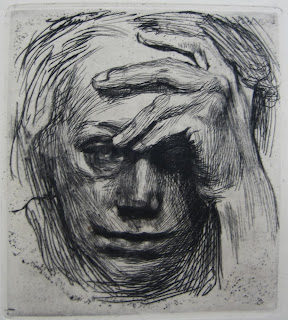
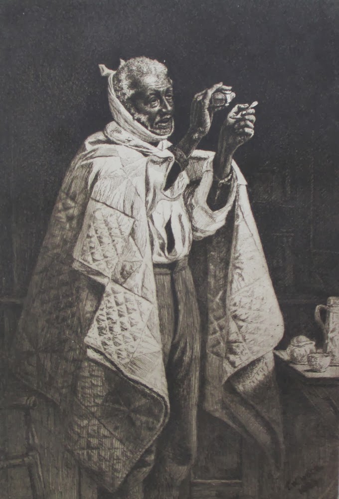
Marcellin Desboutin, Desboutin dit à la bavette
(aslo known as Desboutin tenant sa pipe de la main gauche, or as L'auteur fumant, à mi-corps)
Drypoint, 1897
Ref: Clément Janin 67
Actually, Marcellin Gilbert Desboutin came from a well-off, cultured background. He was born in Cérilly in 1823. His mother was an aristocrat, and Marcellin was a wealthy young man whose dabblings in literature and art were enthusiastic hobbies rather than career choices. He bought himself a grand villa outside Florence, where he lived from 1854, dealing in old master paintings, gambling, and generally squandering his fortune. During this time, Desboutin maintained contacts with the Paris art world, and was particularly close to Degas. In Florence he met and encouraged the Italian Impressionist Giuseppe de Nittis, with whom he remained on close terms; there exists a drypoint portrait of Degas about which experts remain divided as to whether it is by Desboutin or de Nittis.

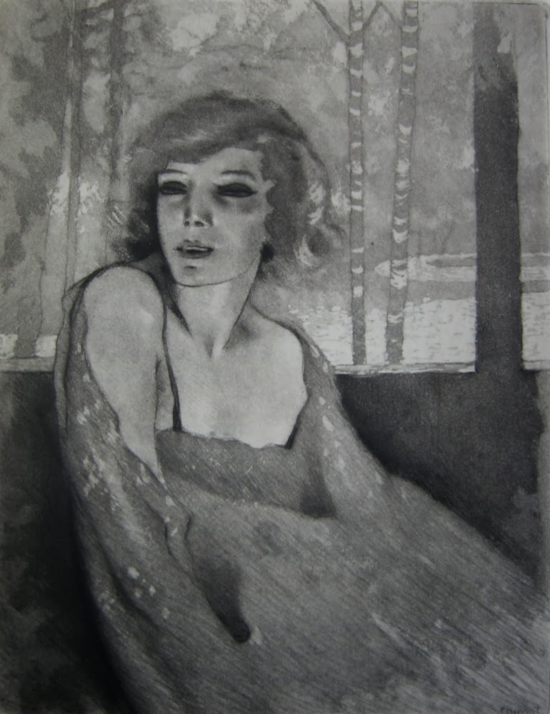
Marcellin Desboutin, Femme au toutou, ou au chien
Drypoint, c. 1878
Ref: Clément-Janin 101
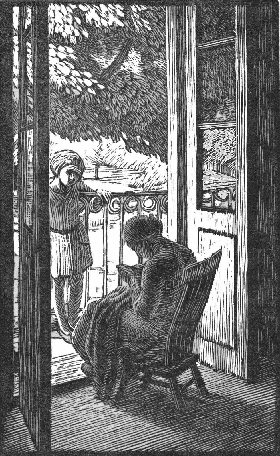
Marcellin Desboutin returned to Paris in 1873, at the age of 50, having ruined himself with unwise investments. Here he returned seriously to art, both painting and printmaking. Desboutin specialized in portrait drypoints, often of fellow artists such as his friends Degas, Renoir, Manet, Morisot, Raffaëlli, Goeneutte and Guérard, but also of authors such as Dumas fils, Zola, and Verlaine. Desboutin's technique was to quickly sketch a portrait on copper with a drypoint needle, to catch his subject in as relaxed and lifelike a pose as possible.

Marcellin Desboutin, Norbert Goeneutte
Drypoint, 1876
Ref: Clément-Janin 111

Marcellin Desboutin, Renoir, les jambes croisées
Drypoint, 1877
Ref: Clément-Janin 208

Marcellin Desboutin, Willette, en Pierrot
Drypoint, 1896
Ref: Clément-Janin 241
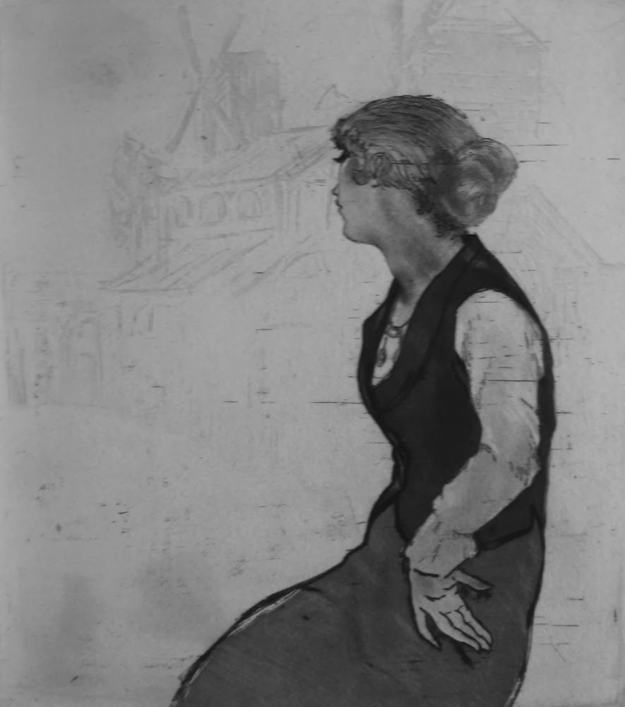
One of Desboutin's portraits of artists, that of Pierre-Cécile Puvis de Chavannes, uses a very interesting mixed technique, invented by Félicien Rops and used infrequently by artists such as Louis Legrand and Desboutin. Based on a painting by Desboutin now in the Musée d'Amiens, this print involved making a héliogravure plate after a painting (as in this case) or an etching that needed to be reduced in size (as in the case of Legrand's La parole divine, my only other example of this process); the artist then worked on top of the heliogravure with a drypoint needle, thus producing a strange hybrid between a reproduction and an original print. The composition in the background is part of Puvis's Bois sacré.

Marcellin Desboutin, Puvis de Chavannes, portrait et composition
Drypoint on héliogravure
Ref: Clément Janin 204

Marcellin Desboutin, Jules Jacquemart
Drypoint, 1876
Ref: Clément-Janin 141
It's interesting to compare the vivacity of Desboutin's portraits from life, such as those of Goeneutte and Renoir, with the eight drypoint portraits of singers and dancers for the anonymous work L'Opéra, Eaux-fortes et Quatrains in 1876 (the author was Henry Cohen). Seven of these are drawn after photographs rather than from life, and although they have great charm, they are much stiffer and more conventional than the free depictions of his friends; the exception is the portrait of Léontine Beaugrand. On all eight the printer, Vve Cadart, has misspelled the artist's name as Desboutins.

(bass-baritone 1822-1872)
Drypoint after a photograph by Pierre Petit, 1876
Ref: Clément-Janin 186
(soprano, dates unknown)
Drypoint after a photograph by Pierre Petit, 1876
Ref: Clément-Janin 187
(ballerina, 1842-1925)
Drypoint from life, 1876
Ref: Clément-Janin 188

(mezzo-soprano, 1844-1891)
Drypoint after a photograph by Pierre Petit, 1876
Ref: Clément-Janin 189

(bass, 1835-1905)
Drypoint after a photograph by Pierre Petit, 1876
Ref: Clément-Janin 190

(baritone 1834-1903)
Drypoint after a photograph by Pierre Petit, 1876
Ref: Clément-Janin 191

(bass, and future director of the Opéra, 1848-1918)
Drypoint after a photograph by Pierre Petit, 1876
Ref: Clément-Janin 192

(ballerina, 1850-1909)
Drypoint after a photograph by Luckhardt, 1876
Ref: Clément-Janin 193
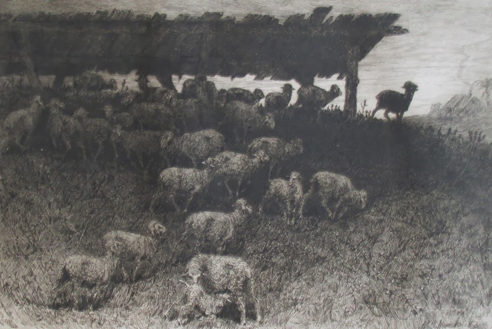
Despite his late start, Desboutin achieved some fame and success as an artist in the Bohemian circle of Manet and Degas; he exhibited six works at the Second Impressionist Exhibition. The catalogue of his works in Clément-Janin's La Curieuse Vie de Marcellin Desboutin lists 246 original prints and 30 "gravures de réproduction" after artists such as Israëls, Fragonard, and Rembrandt; there's also an impressive list of paintings, showing Desboutin to have been hard at work at his art from 1873 to his death.

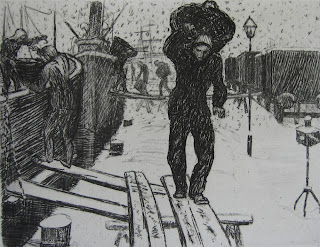
Marcellin Desboutin, Les travailleurs de la mer (also known as Les amarreurs)
Drypoint after a painting by Jozef Israëls, 1889
Ref: Clément-Janin 1 (gravures de réproduction)
From 1880 Desboutin lived mostly in Nice, where he died in 1901.